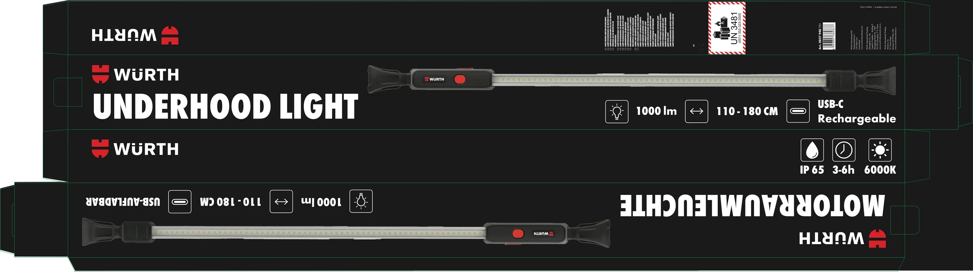
Packaging
Würth Underhood Light
Premium black packaging for a long, narrow box, built to be read at a glance.
For this sample project, I developed retail-ready packaging for the Würth Underhood Light, balancing strict brand guidelines with the challenges of a long, narrow format. Competitive research and a clear information hierarchy informed a premium, high-contrast design featuring bold product imagery, accessible bilingual content, and technical details that communicate quality and performance.
The Brief and Constraints
Create retail packaging for a new product, following the Würth brand guidelines strictly, with black as the primary color.
- Primarily black
- Built for retail
- Follows the Würth style guide
- A long, thin package
- Professional, powerful and authentic
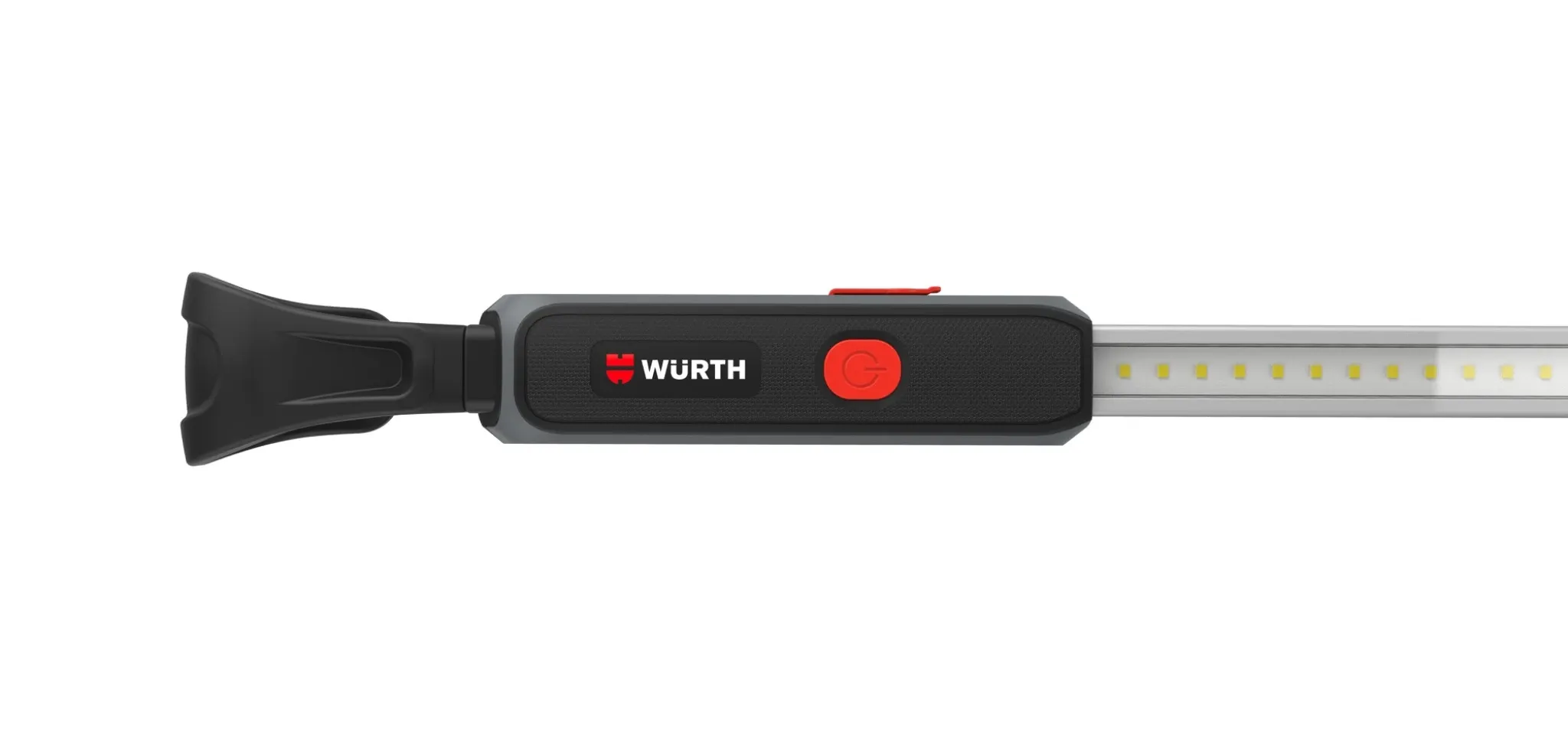
Research
- Milwaukee: bright, powerful, technical, known
- LITESTIX: high contrast, technical
- NextLED: convenient, utilitarian
- GROZ: hardware, handy, straightforward
Where Würth should sit: professional, technical and dependable, showing what it does best, quality engineering. The guiding line: good design, low clutter, efficient communication.
Design Decisions
On a long, narrow box, nobody should have to search for information. The goal: easy to read, premium to look at. From a distance, clean and high contrast. Up close, clear communication.
The hierarchy, in order:
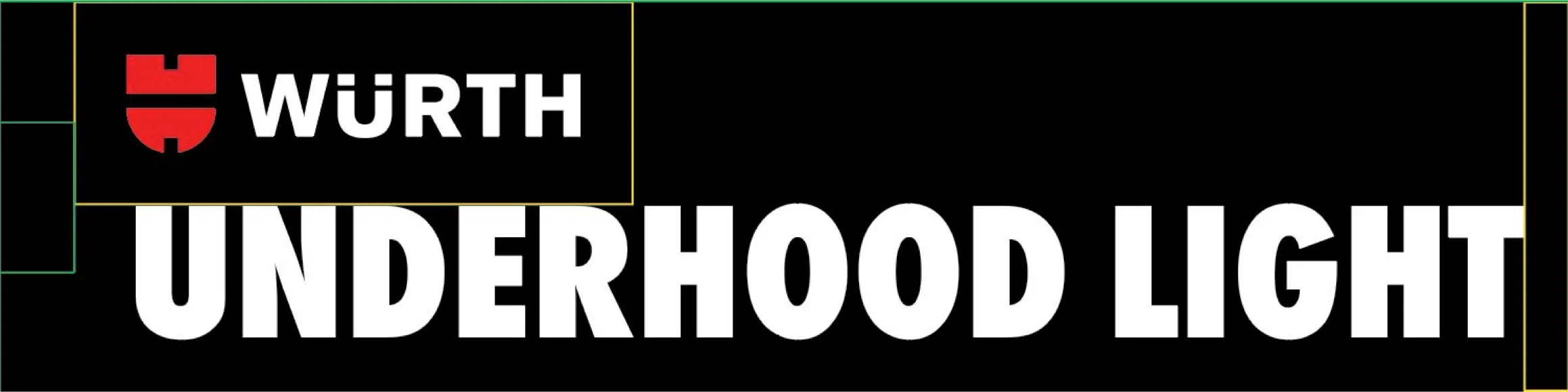
- Würth logo: signals premium German engineering immediately.
- Product name: “Underhood Light” is the industry-standard term.
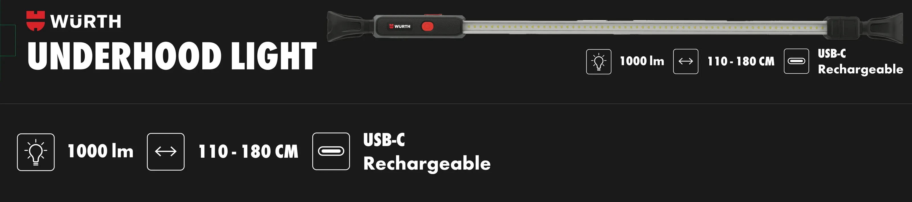
- Selling points: why Würth over other brands.
- Visuals: a large product shot that uses the full length of the box.
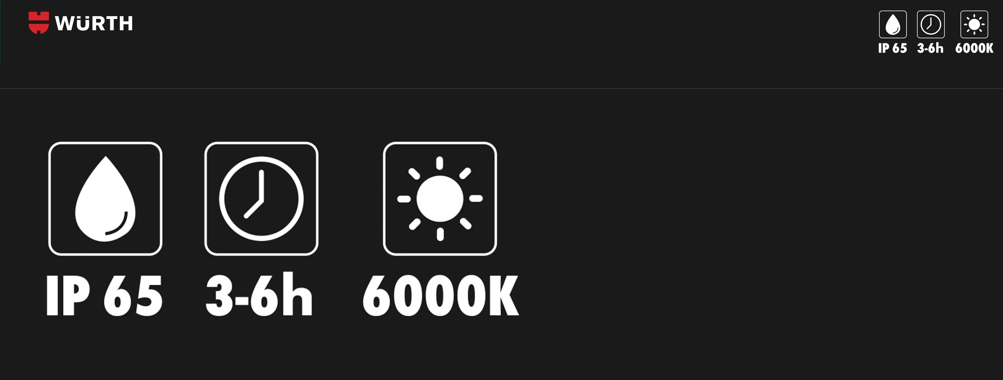
- Specifications: on the side, to “seal the deal” for customers who look closer.
The Package


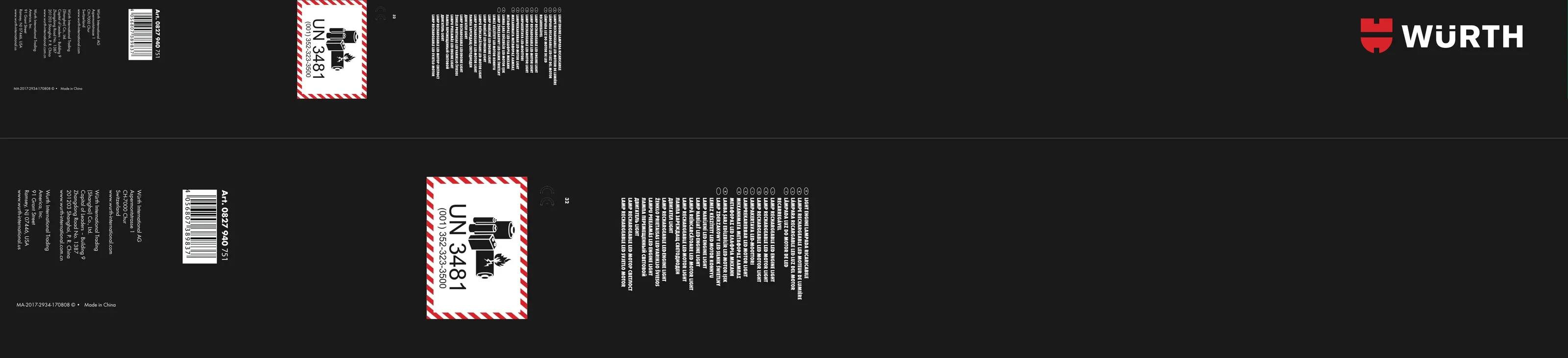
The Full Layout